

Sampson Equine Services
Towards the end of 2017, I was commissioned to create a custom logotype and logomark design, as well as business cards, for a new local equine business on the Mornington Peninsula.
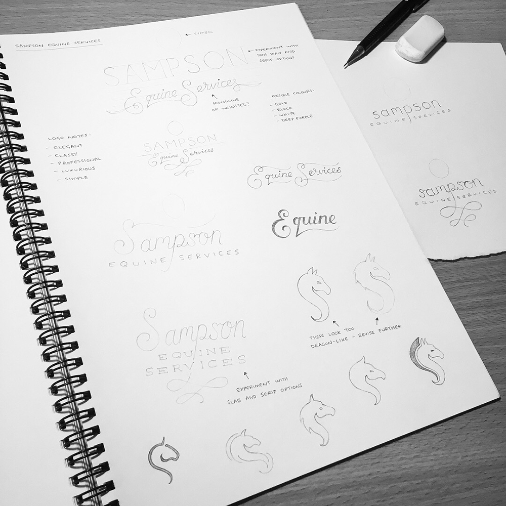
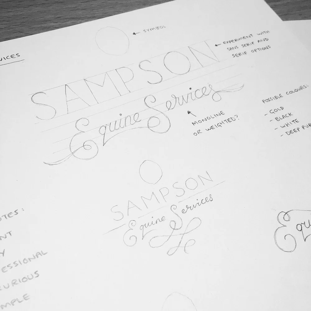
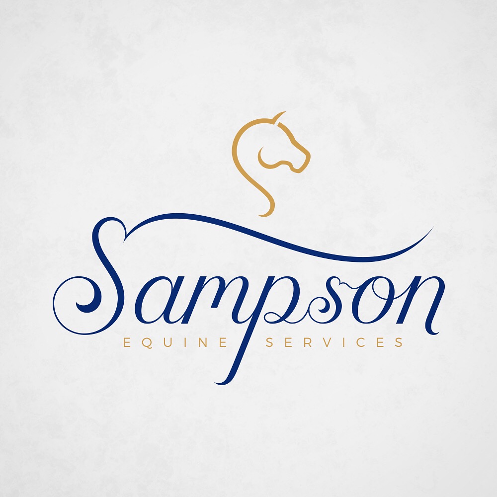
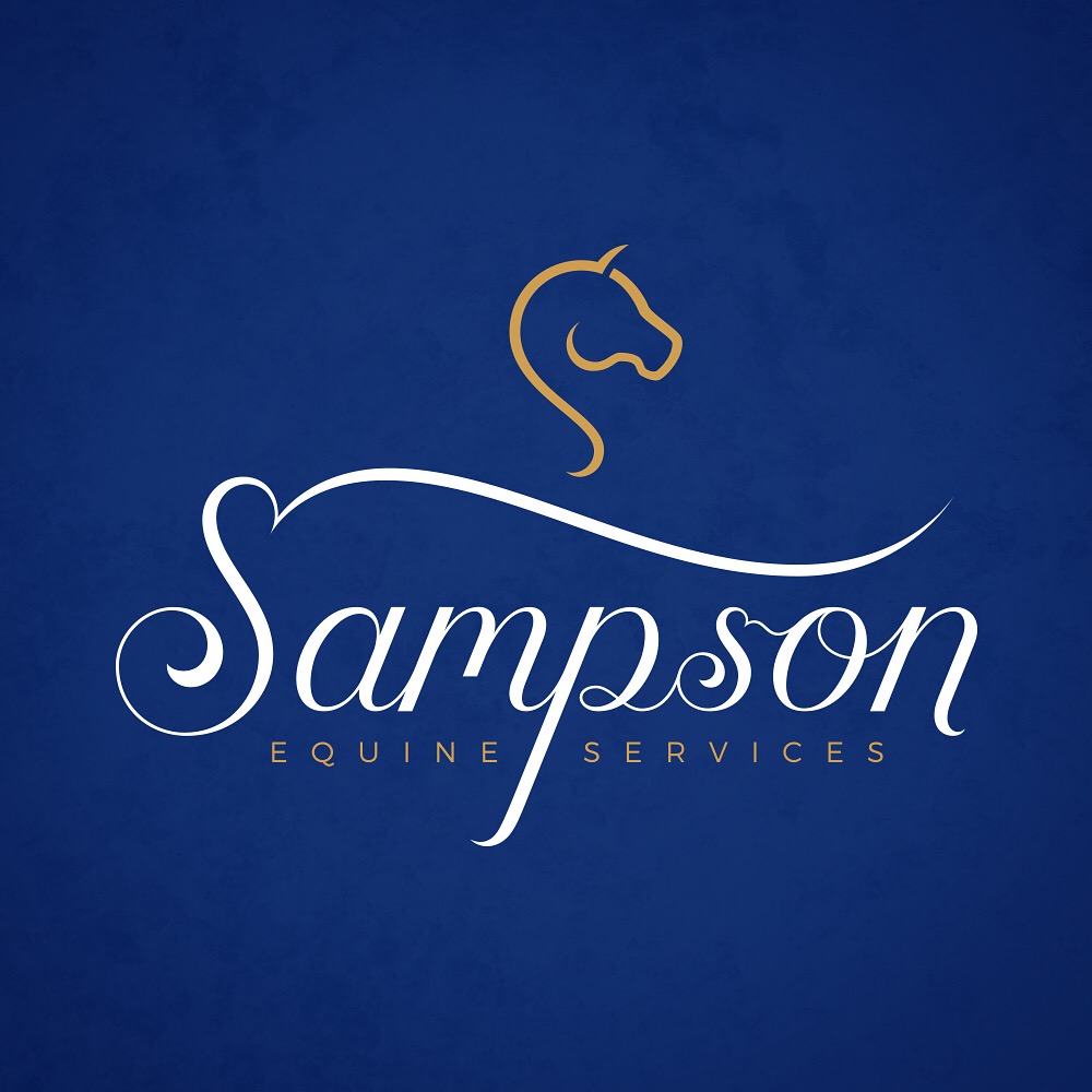
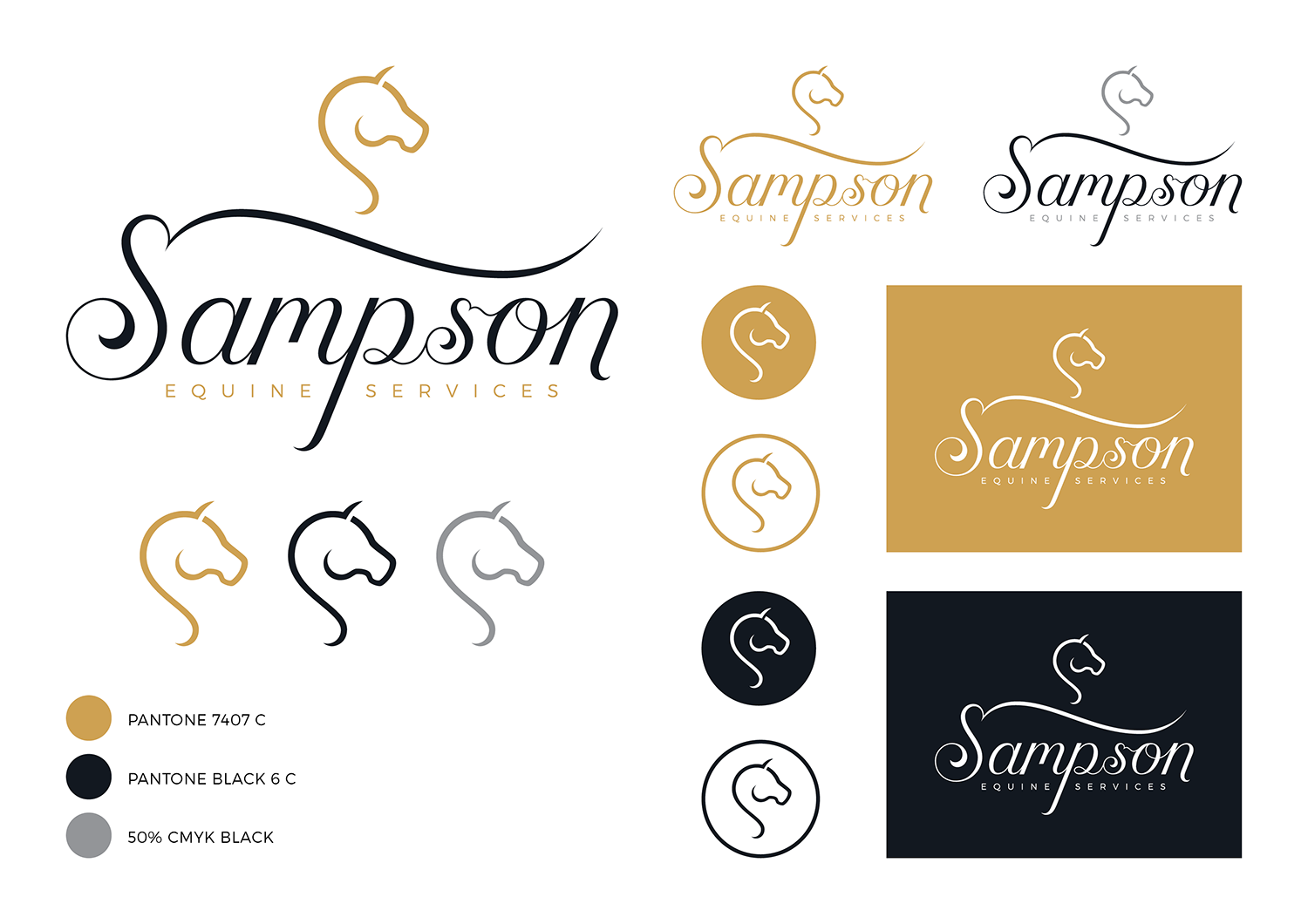
The logo needed to be simple with an elegant, professional and luxurious appearance, so I began sketching out a few concepts in pencil, prioritising the style and composition of the type before I developed a symbol to complement the design.
After submitting the initial concepts to my client, we both agreed that 'Sampson' should be done in a captivating cursive style and 'Equine Services' in a classy sans serif font.
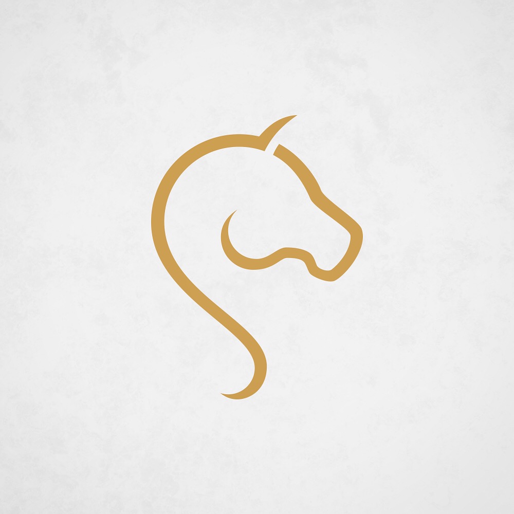
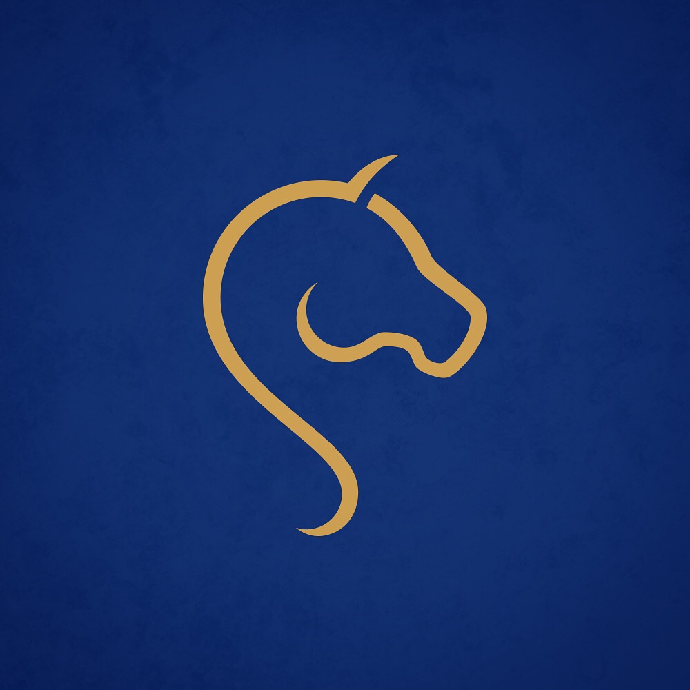
As for the logomark, I needed to create something that would not only work well with the typography when displayed as part of the full logotype, but also something that would be strong enough to hold its own without the need of any type.
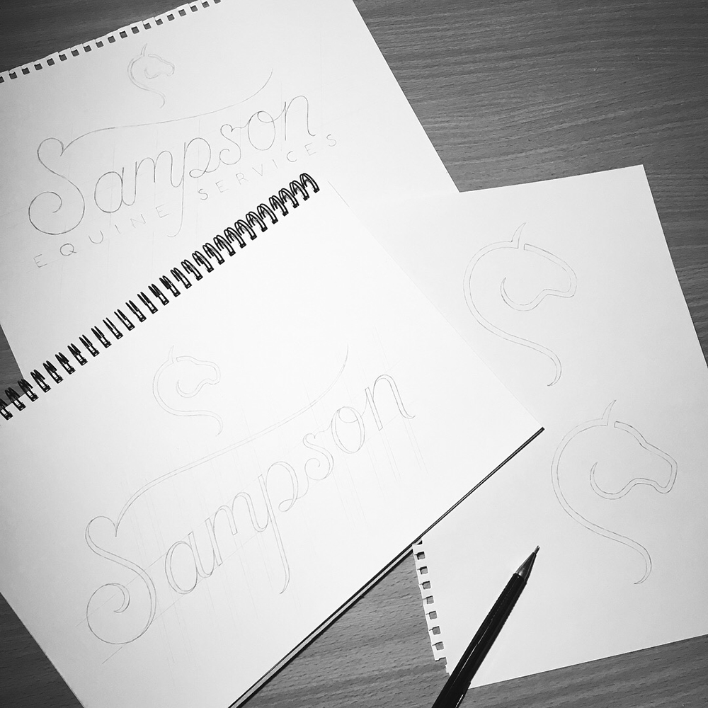
During the research stage, I found that the majority of equine companies have an image of a horse as part of their logo, but very few of them are unique enough to work without accompanying typography. So with the Sampson Equine Services logo, I experimented with the idea of merging the shape of a horse's head with that of a letter 'S' - my first attempts looked a bit too much like a dragon or a seahorse, so I simplified the design further and eventually found a solution that ticked the boxes of what I was aiming to achieve with the logomark.
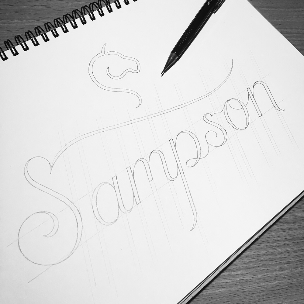
With my client's approval of both the lettering work and logomark concept, I was ready to develop the full logotype by testing the stroke weight of the lettering and the form of the horse head symbol, and then combining those two elements. The thick-to-thin transition in the cursive lettering was the better option as I felt 'Sampson' stood out more in contrast to the mono-weighted 'Equine Services'.
I then began working on the logo in Adobe Illustrator, refining the curves, stroke weights, kerning and the positioning of the symbol, as well as experimenting with various fonts to accompany the lettering and symbol. After deciding on the Montserrat typeface, the final stage of the process was to test a few colour palettes that would best suit the brand identity.
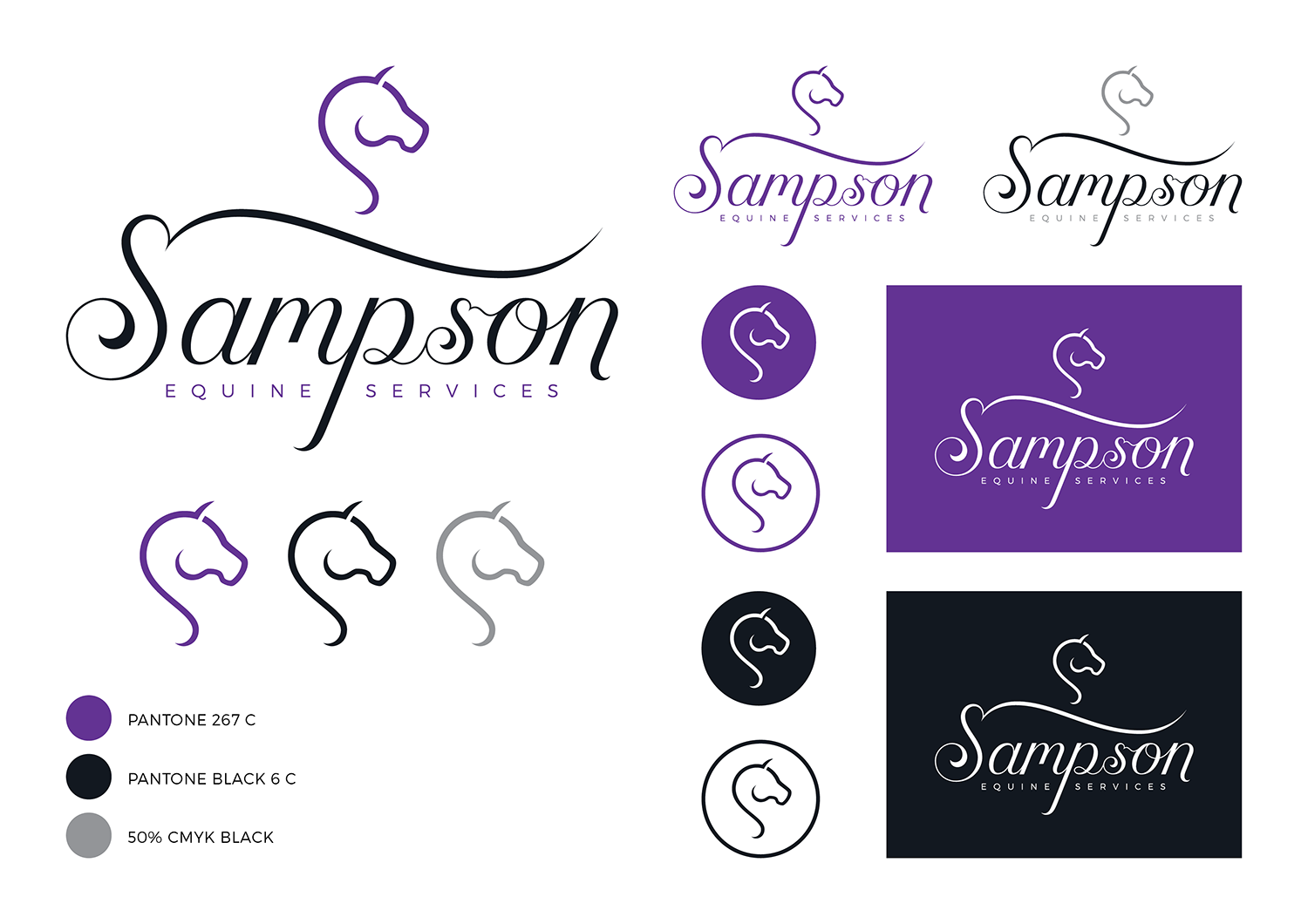
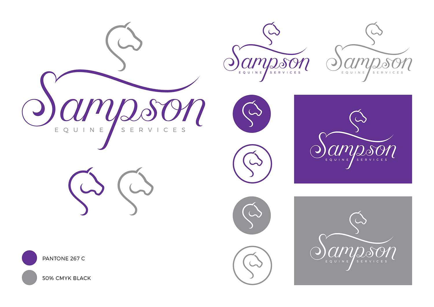

The slideshow above showcases the 5 colour palettes I chose to submit to my client for feedback.
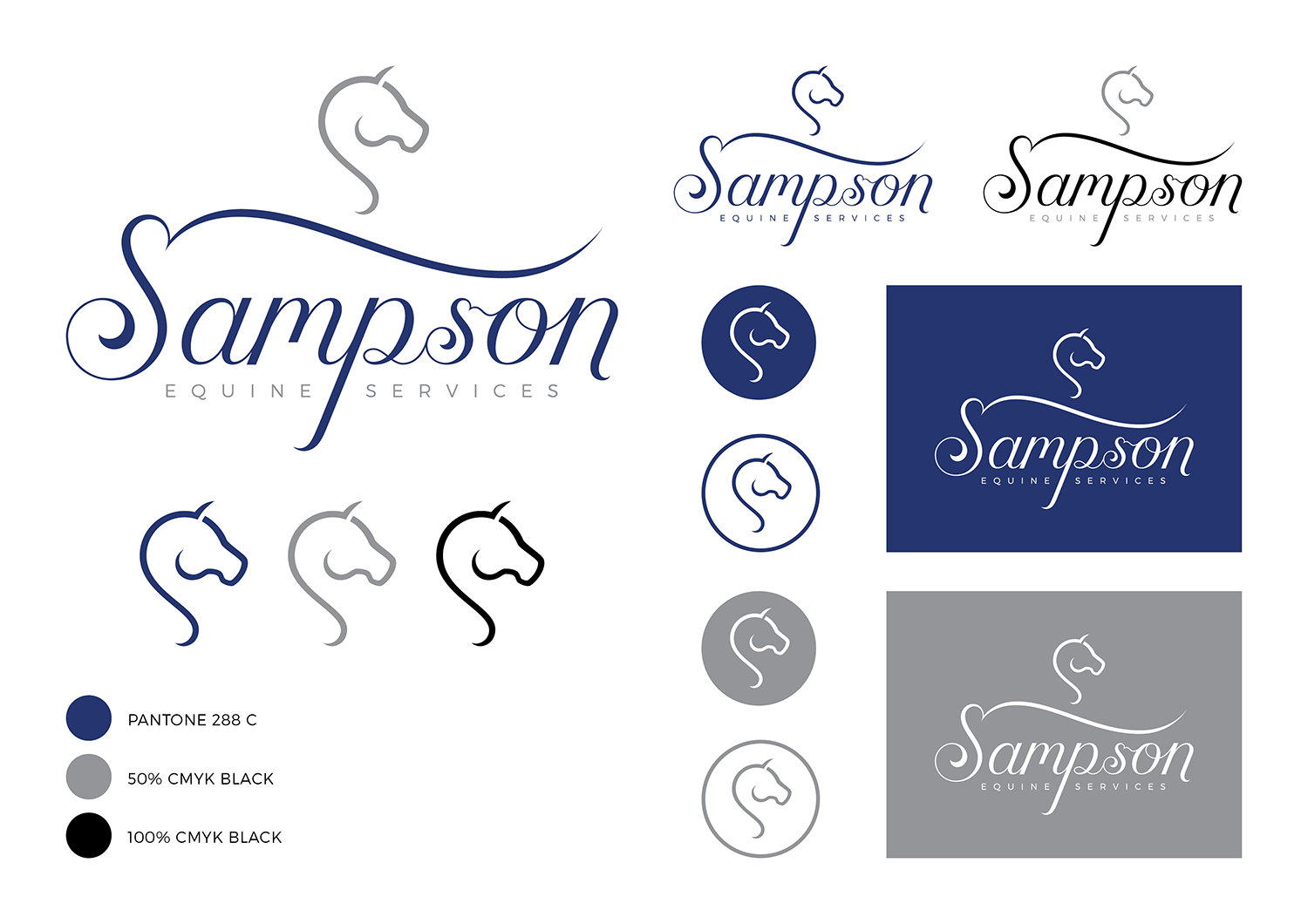
Eventually, my client and I both agreed that the colour scheme of gold, navy blue, black and white was the best choice - the use of gold in the logo is intended to convey a sense of prestige, quality and luxury, whilst the navy blue represents trust and integrity.
Click on an image below and use the left and right arrows to browse through the gallery of mockups I created!


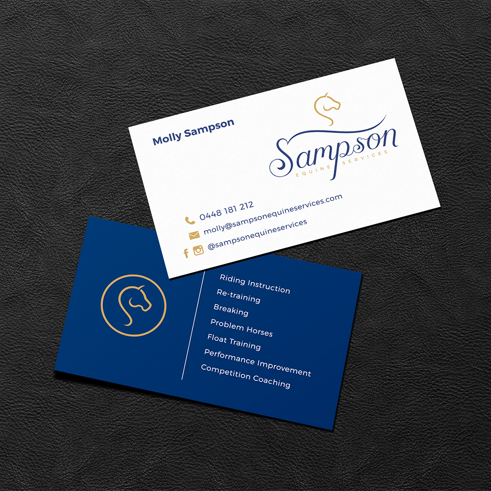
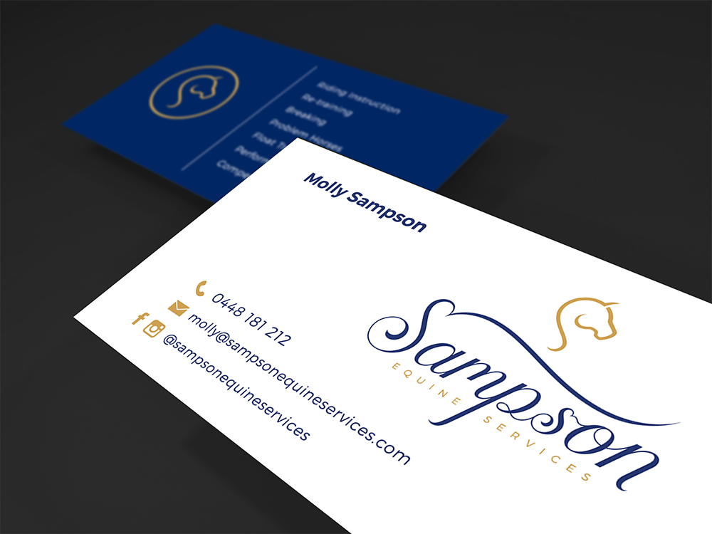
After completing the custom logotype and logomark, I conjured up a few business card design layouts - the mockup images pictured on the left are of the final chosen design, with the full colour logotype and contact details on the front, and the golden logomark badge and business services on the back.
Copyright © 2018 Caligature™ • All rights reserved