
“I am so glad to have to chosen Calvin to do our logo! We’re all so impressed and extremely happy with his work”
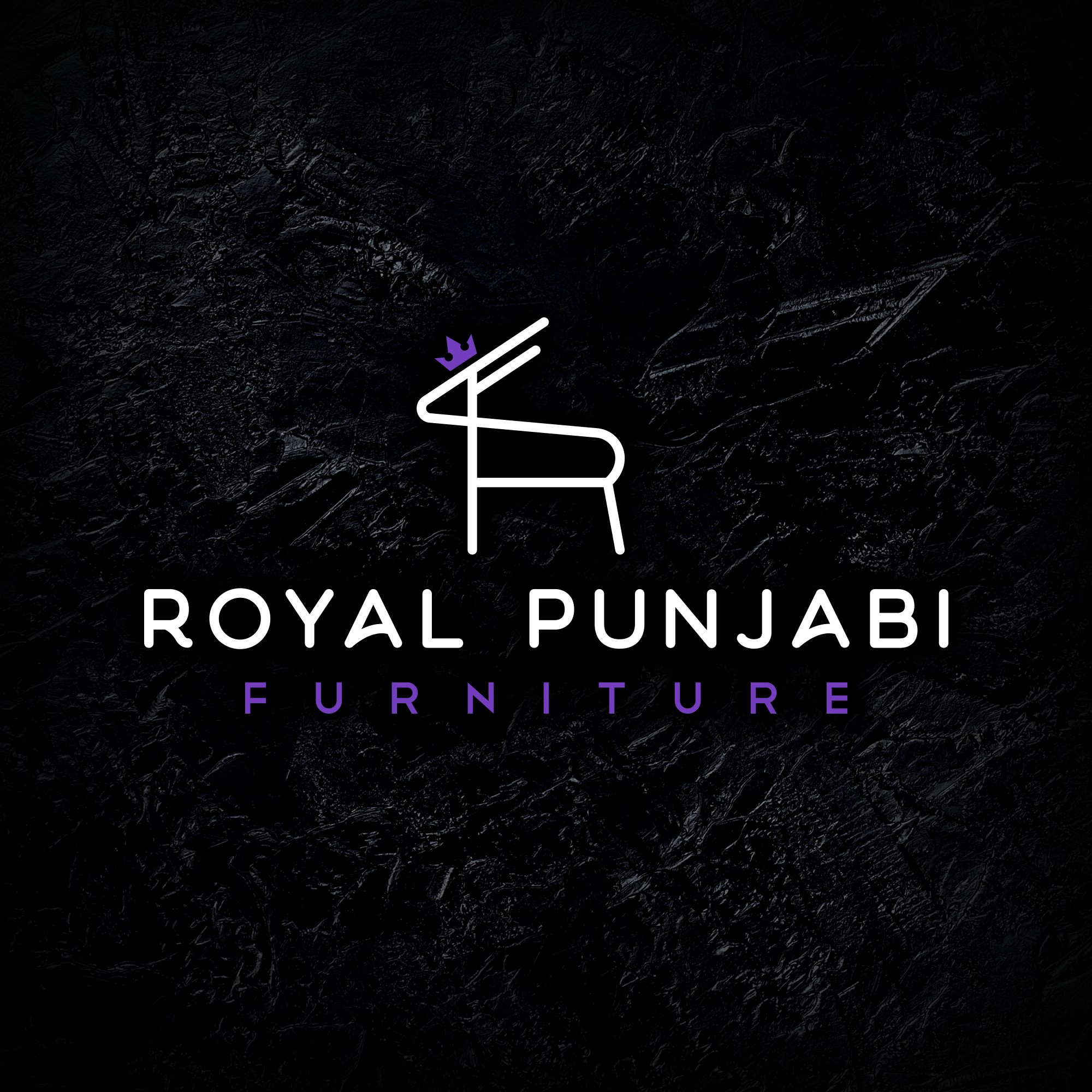
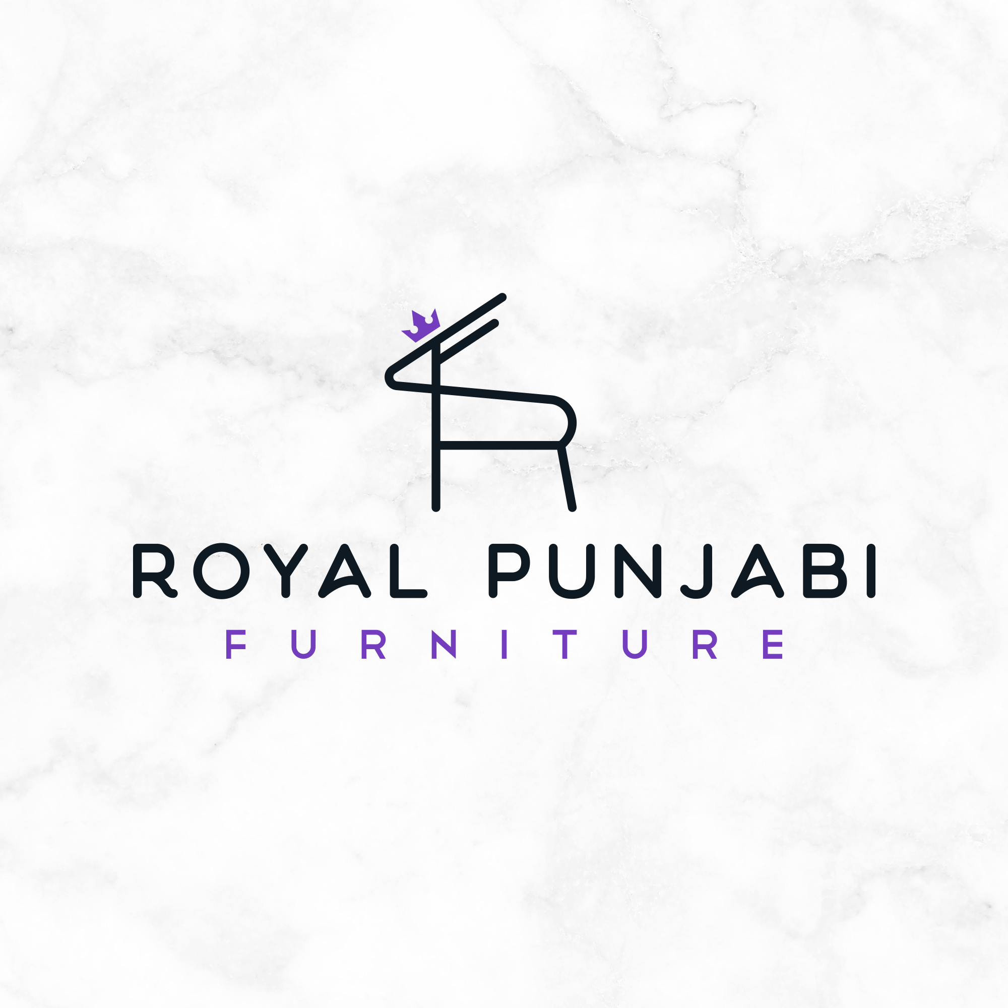
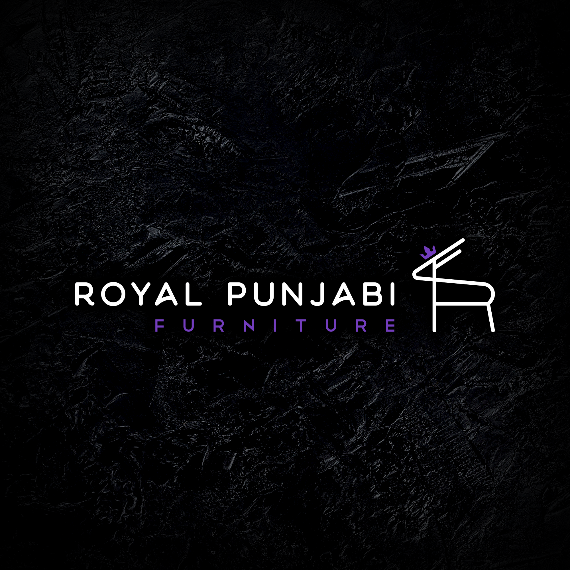
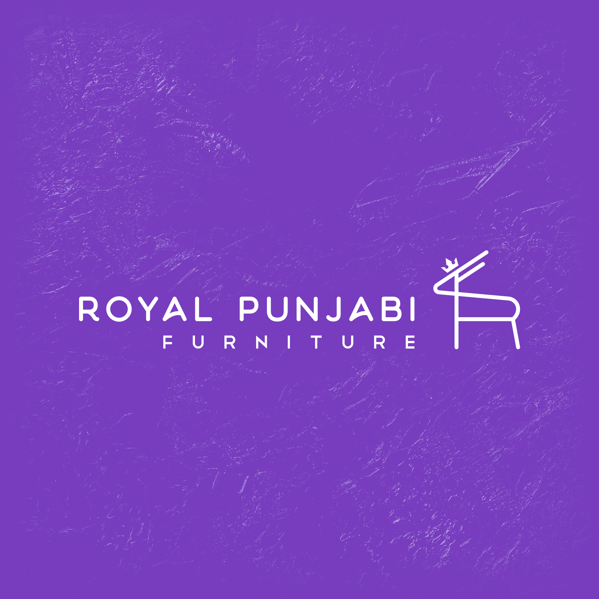
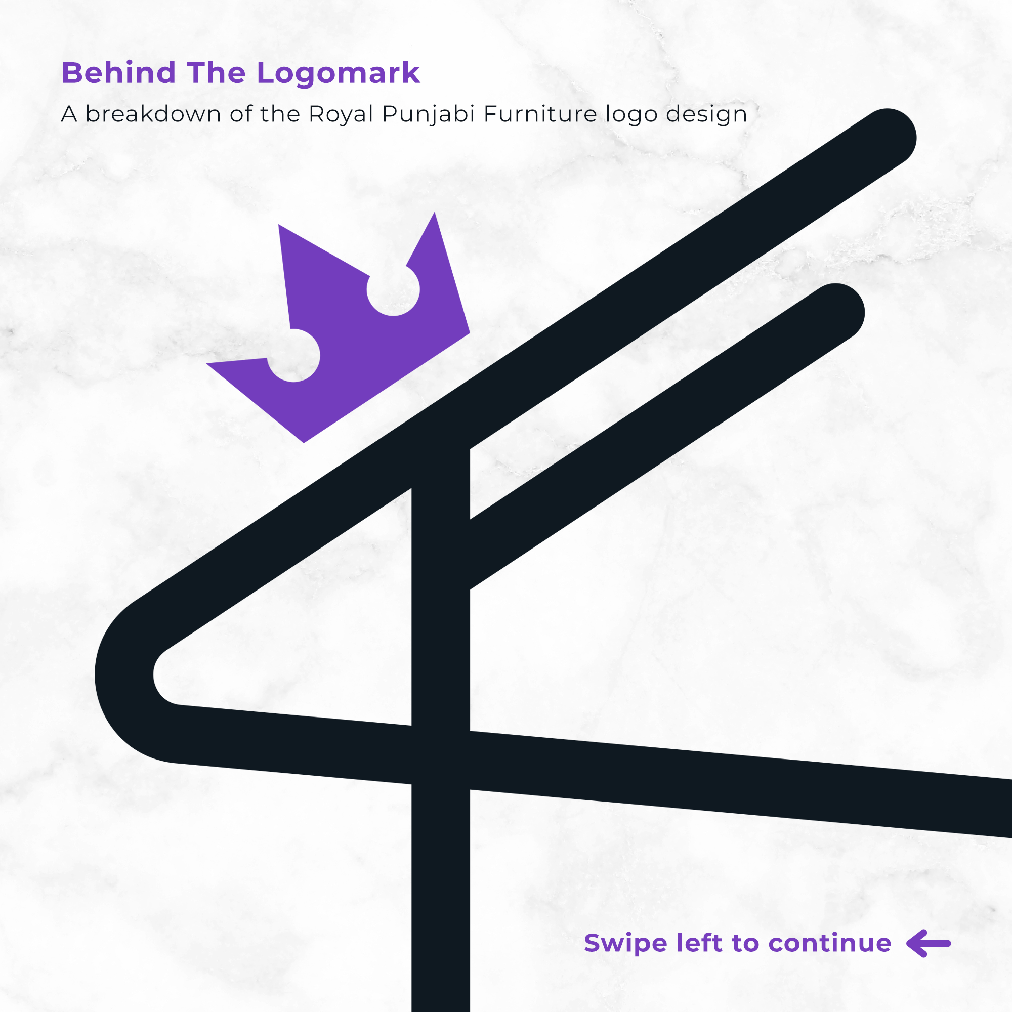
Royal Punjabi Furniture
With this logo project, I was required to create a distinctive, modern logotype and logomark for an upcoming Melbourne-based furniture company, specialising in both traditional and contemporary Punjabi furniture. The logo had to embody a sense of luxury and grandeur, as well as having a friendly and welcoming appearance.
Royal Punjabi Furniture will be based in Cranbourne, a suburb south-east of Melbourne, where there is a large Indian community residing in the area. The target audience of this brand is men and women aged 25-65 who are looking for specially made Punjabi-style furniture. Due to there only being a handful of other Indian furniture companies in and around Melbourne, RPF offers a whole new array of options for customers looking for unique, decorative, high-end furniture that is crafted in Punjab.
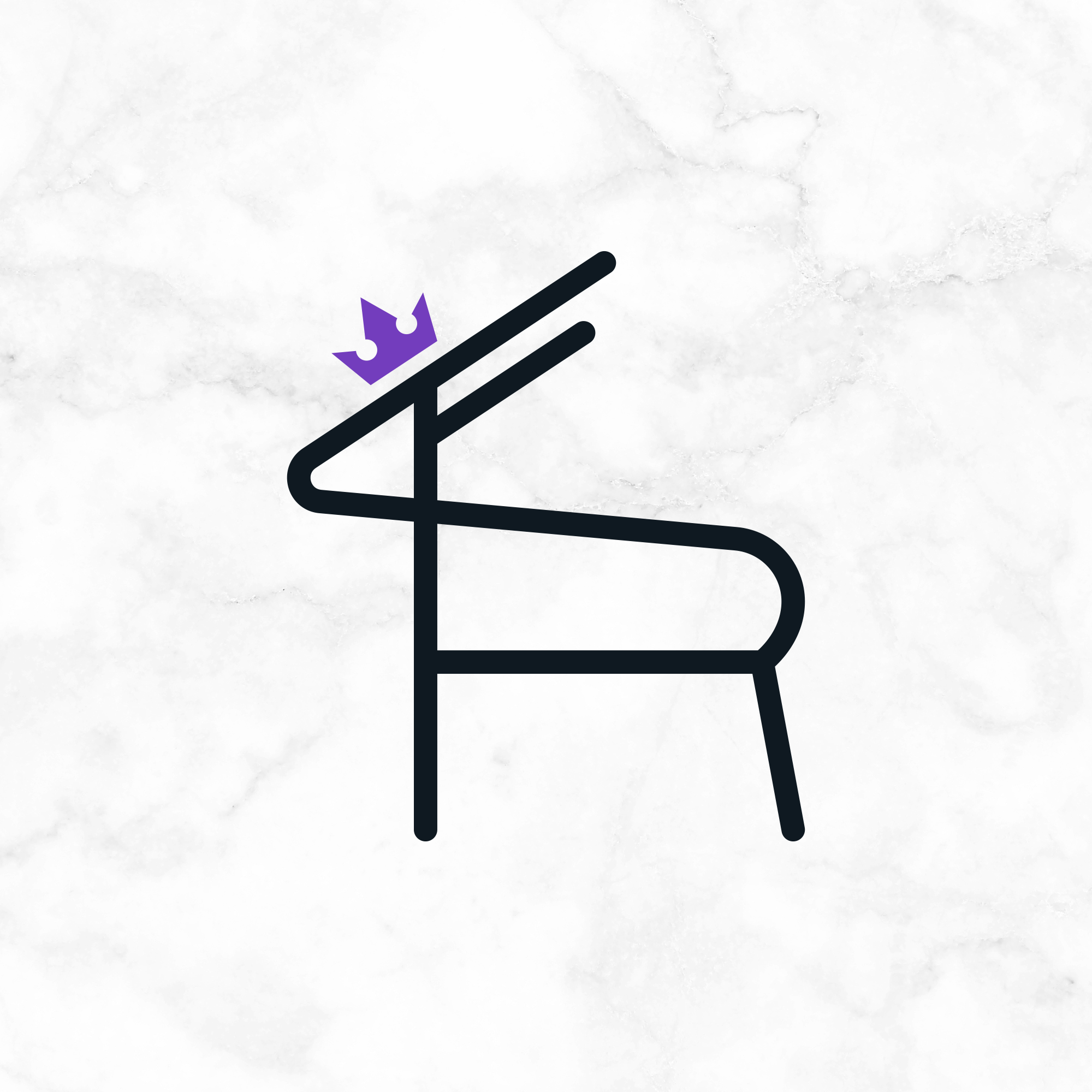
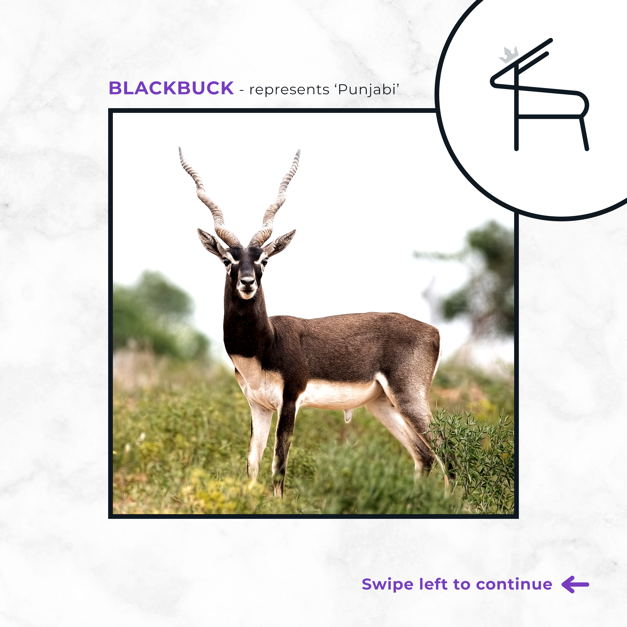
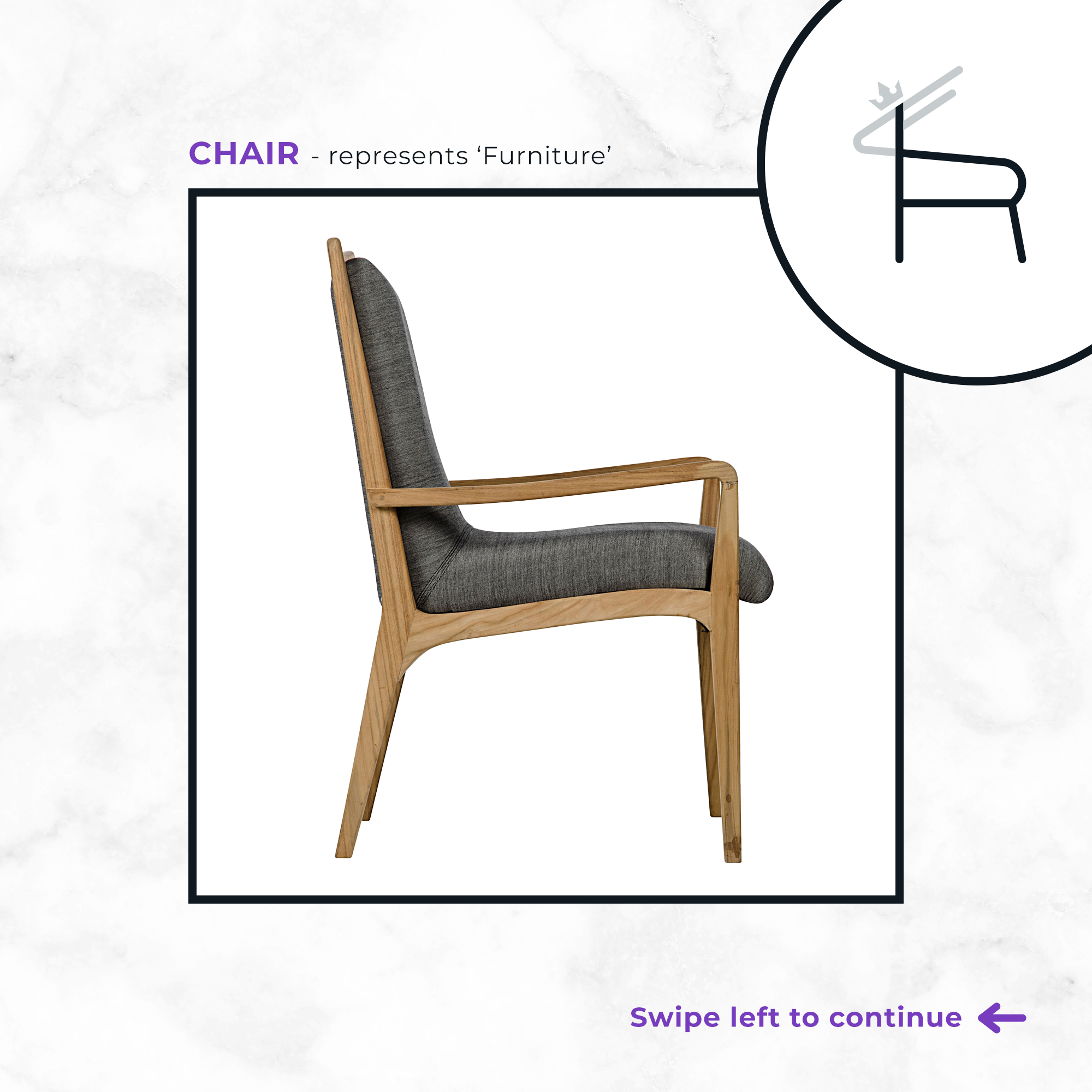
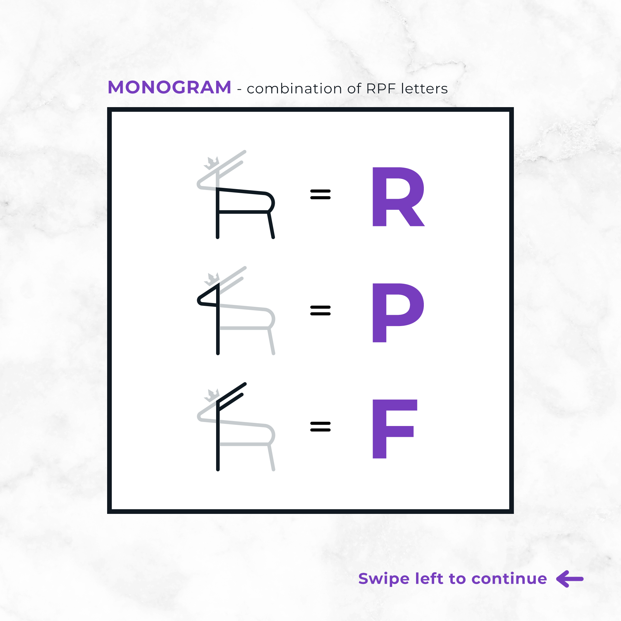
In the early stages of the design process, I researched that the blackbuck (Indian antelope) is the State Animal of Punjab, so I wanted to see if I could somehow incorporate the animal into the logo. After sketching a few ideas out on paper, I eventually developed a concept that integrated the blackbuck to symbolise Punjab, a chair to represent that it’s a furniture brand, and a monogram of the RPF letters.
To put the cherry on top - or, in this case, a crown - and complete the logomark composition, I added a little crown on the top of the blackbuck’s head to represent the ‘Royal’ part of the brand name.


For the full logotype design, I experimented with a variety of different font combinations but it ultimately came down to editing the Aquatico font for ‘Royal Punjabi’ and using Telegrafico for ‘Furniture’. The rounded letters of the Aquatico font complemented the rounded line cap style of the logomark perfectly, but the disconnected junctures of the default R, P and B letters didn’t suit the overall design, so I extended them to match the joined lines within the logomark.

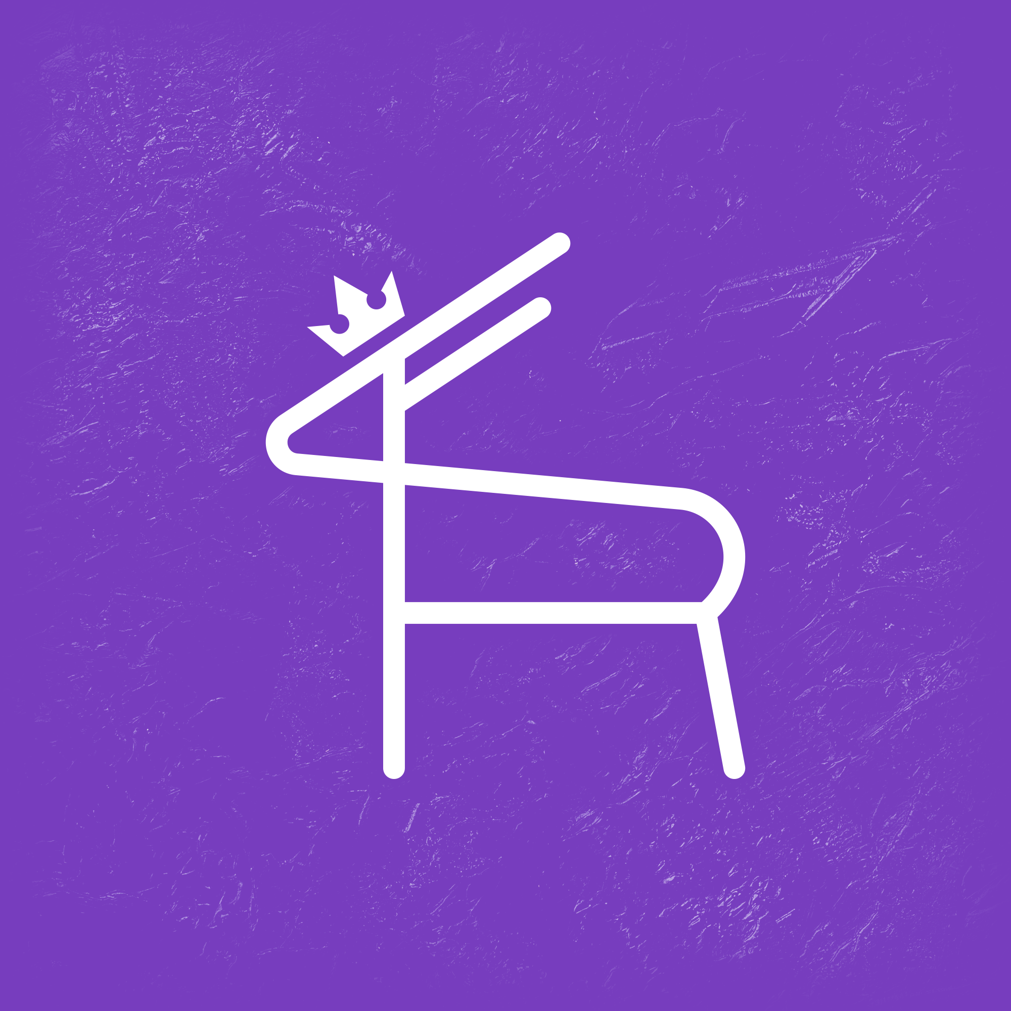
I then tightened up the kerning of the letters and positioned the logomark so that it was optically centered instead of mathematically centered. The legs of the blackbuck symbol line up with the middle three letters (N, I and T) of ‘Furniture’ as it looks more balanced than if the logomark was mathematically centered.
As for the brand’s colour palette, my client and I had decided on three potential colour schemes; purple and gold/yellow, purple and black, and blue and gold. After using the Pantone Solid Coated Formula Guide to identify the right hues for these colour schemes, it became clear to us that purple and black looked the most classy and professional. Using a golden yellow for the crown was too obvious and had been done a million times by other brands, whereas the purple (PMS 266 C) is a perfectly vibrant and refreshing choice of colour for the crown. The black (PMS Black 6 C) is also really nice because it prints as a dark blueish-black which is slightly softer than a pure black.
Copyright © 2020 Caligature™ • All rights reserved