Morsi d'Amore
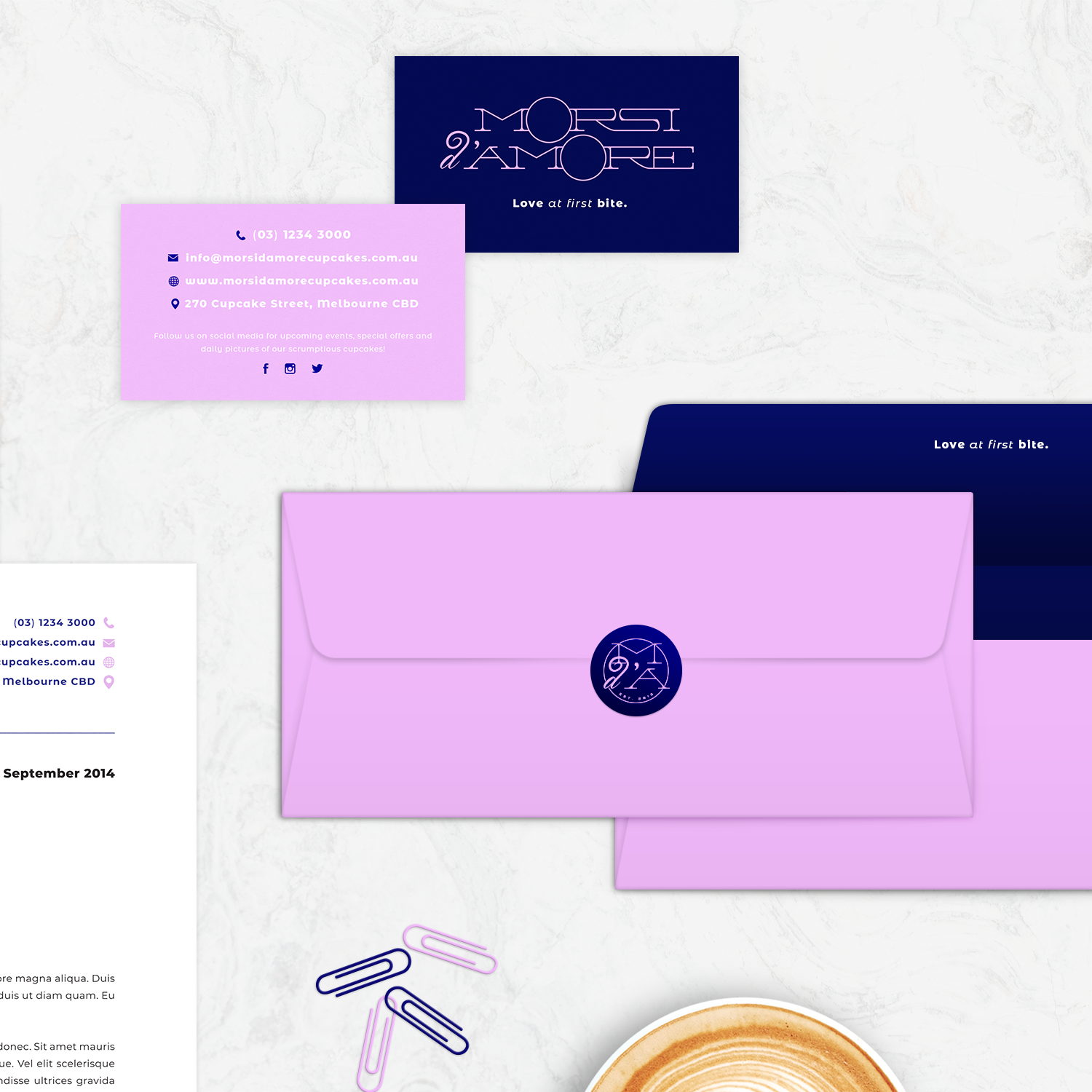
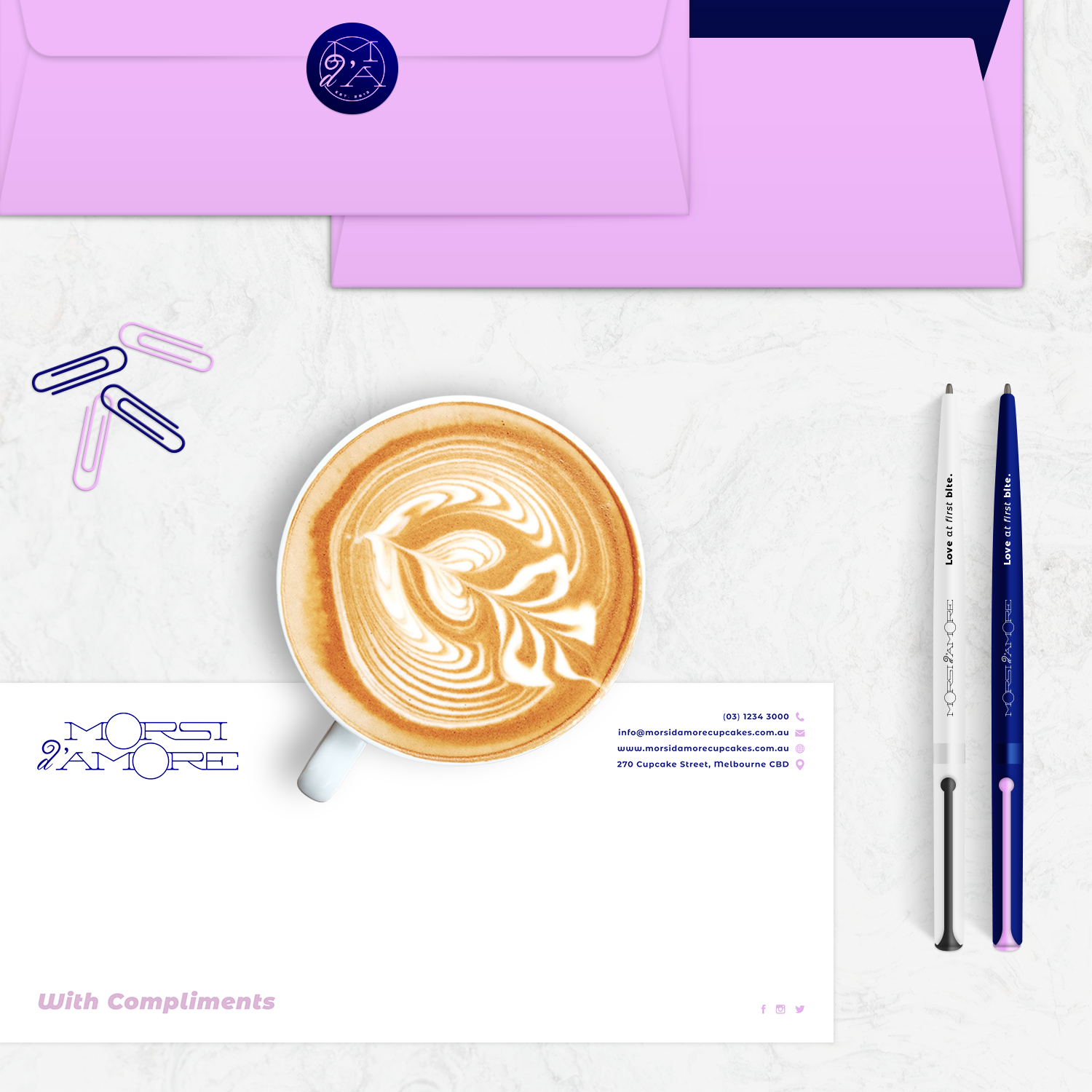
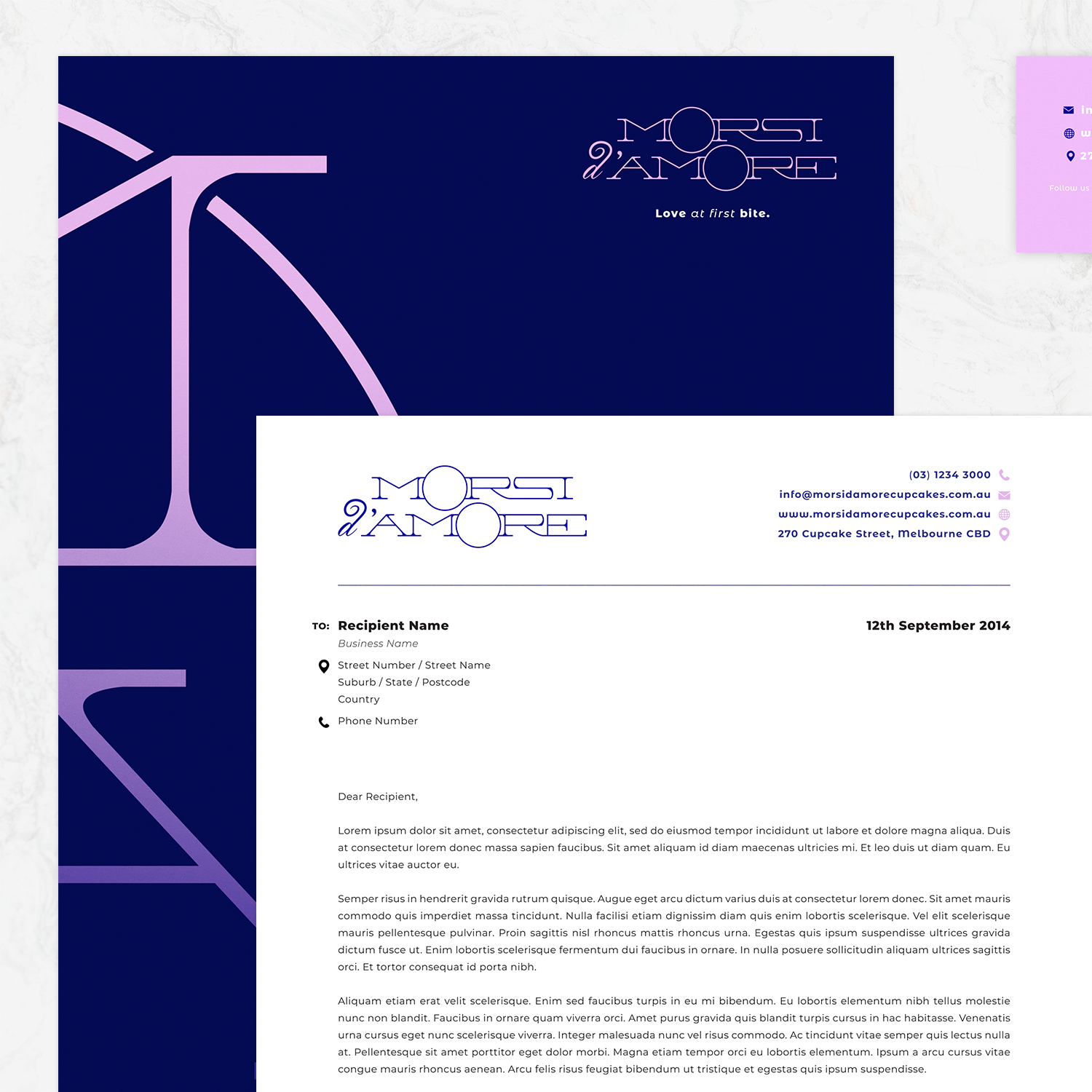
For a corporate identity project at Tractor Design School (formerly Grenadi School of Design), in Melbourne CBD, I was required to invent a fictional brand in the baking industry and develop a custom logotype design for the company. The logo was then to be applied to a full branding stationery set and objects relevant to the brand - such as cake packaging and coffee cups - to showcase a uniform and aesthetically pleasing brand identity.
During the idea generation stage, I was leaning more towards creating a luxurious brand that specialises in premium cupcakes, which would be linked with the connotation of love and elegance. I envisioned this brand as being the ‘Lindt of the cupcake world’, where customers would associate the brand as being of superior quality but slightly more expensive than the typical cupcake company. To achieve this, I needed to come up with a brand name that was not only fun, catchy and memorable, but also sophisticated and seductive.
I ended up going with the brand name ‘Morsi d'Amore’ which means ‘love bites’ in Italian; the name was a perfect fit for the company as the Italian phrase expressed a sense of maturity and class, whilst the English translation matched the concept of small cakes made with love, for lovers.
Due to the upmarket price range and mature style, this brand is targeted towards both males and females aged 18-60, who are employed and who like to treat their lovers on special occasions, such as birthdays, anniversaries, Valentine's Day and various other events.
When conceptualising the logotype, I wanted to take the packaging design into consideration as this would play a huge role in capturing the attention of the target audience and connecting customers with the overall vibe of the brand. I knew the logo would naturally have to be at the top of the hierarchy of elements placed on the packaging, but I also wanted the colourful and enticing imagery of cupcakes to be a major focal point. With the brand name having two O’s, I was able to utilise this by overlaying them with cupcake imagery for the packaging, and simultaneously have them represent two people in love.
The slogan I chose for this brand, ‘Love at first Bite’, came about as a play on words from the phrase ‘love at first sight’. Taking advantage of the rise of pun humour in today’s society, the slogan aims to give the brand some character and to be the comic relief amongst the more serious tone of branding; its purpose is to make the customer feel joyful when opening their box of cupcakes. Additionally, the slogan has a double play on words as it not only aims to describe the way someone will feel when they take their first bite of a Morsi d’Amore cupcake, but with the Italian translation of the brand name meaning ‘love bites’, it also encompasses everything that the brand represents; food, love, elegance and enjoyment.
Copyright © 2015 Caligature™ • All rights reserved


