Aquaman
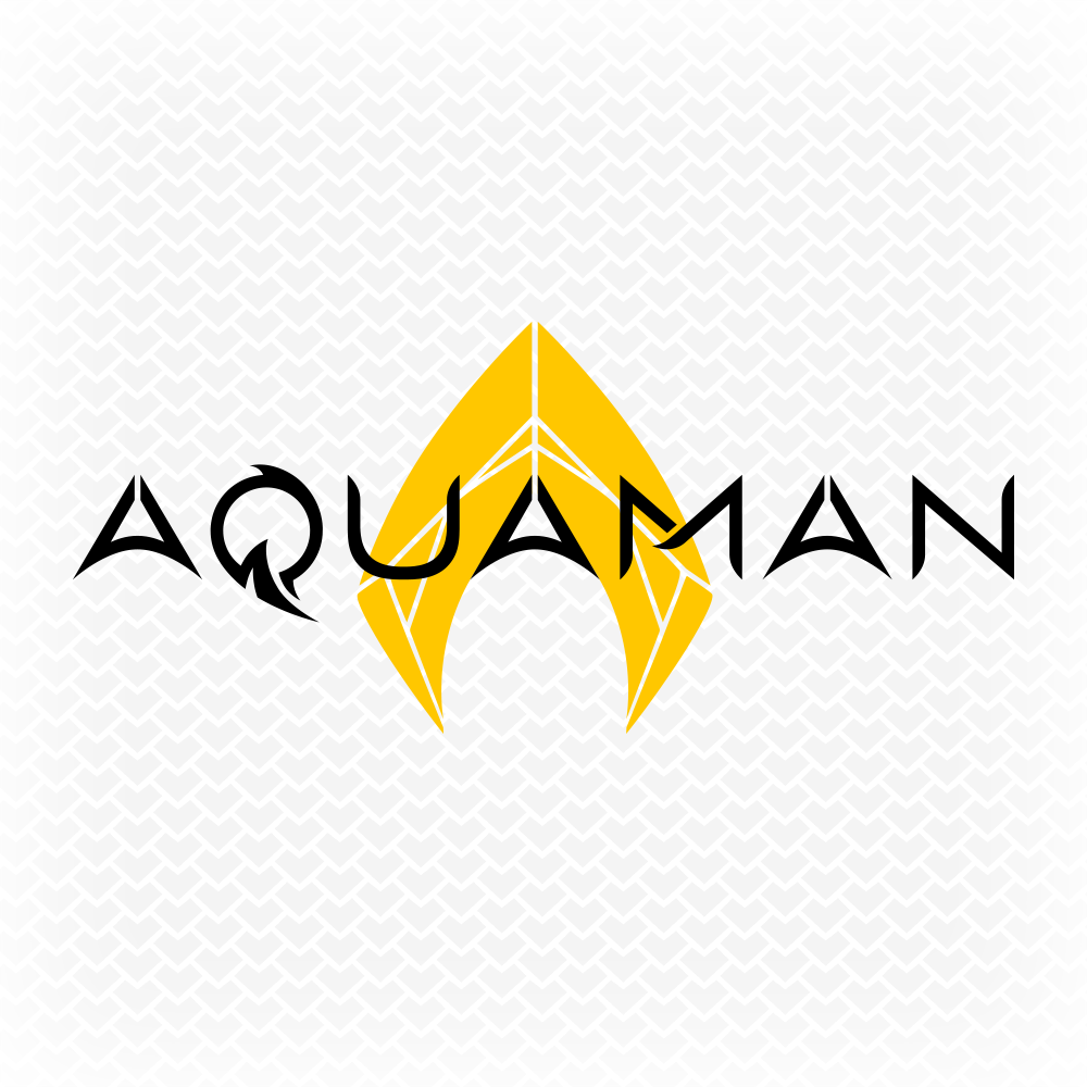
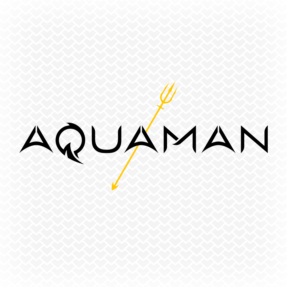
In homage to one of my personal favourite movies of 2018, I decided to put my own spin on the DCEU Aquaman logo with some custom typography and flat vector graphics.
I had initially done a few rough concept sketches in mid-2017 of an Aquaman logotype (pictured left) so I wanted to use those drawings as the foundation for the new logo design, but after redesigning the concept sketch in Adobe Illustrator, it didn’t quite have the same effect as it did on paper - it needed thickening up a bit and looking stronger in style, as opposed to a lightweight typeface with a curvy ligature.
I also tried removing the ligature and seeing how it would look with a minimal sans serif style, but then I realised just how many companies have carelessly rebranded themselves in the past couple of years to simply having a dull, generic sans serif font as their logo - losing all character and uniqueness in the process - so I decided against that and went back to the drawing board. I needed to steer away from classy, elegant and minimal to something more bold and visually striking - more superhero-ish.
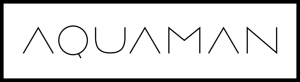
Coincidentally, I had created a unique Q letter design a few months beforehand and I felt that it was the perfect style to use as part of the Aquaman logo - I liked the overall flow of the design and how the descender of the Q reminded me of an ocean wave, which was fitting for this character’s logo - so then it was a matter of matching the other letters with this style.
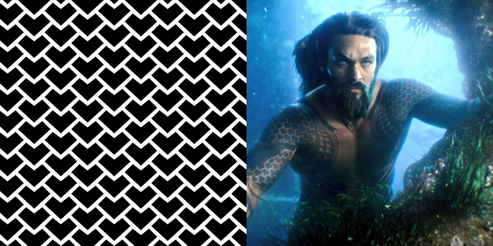
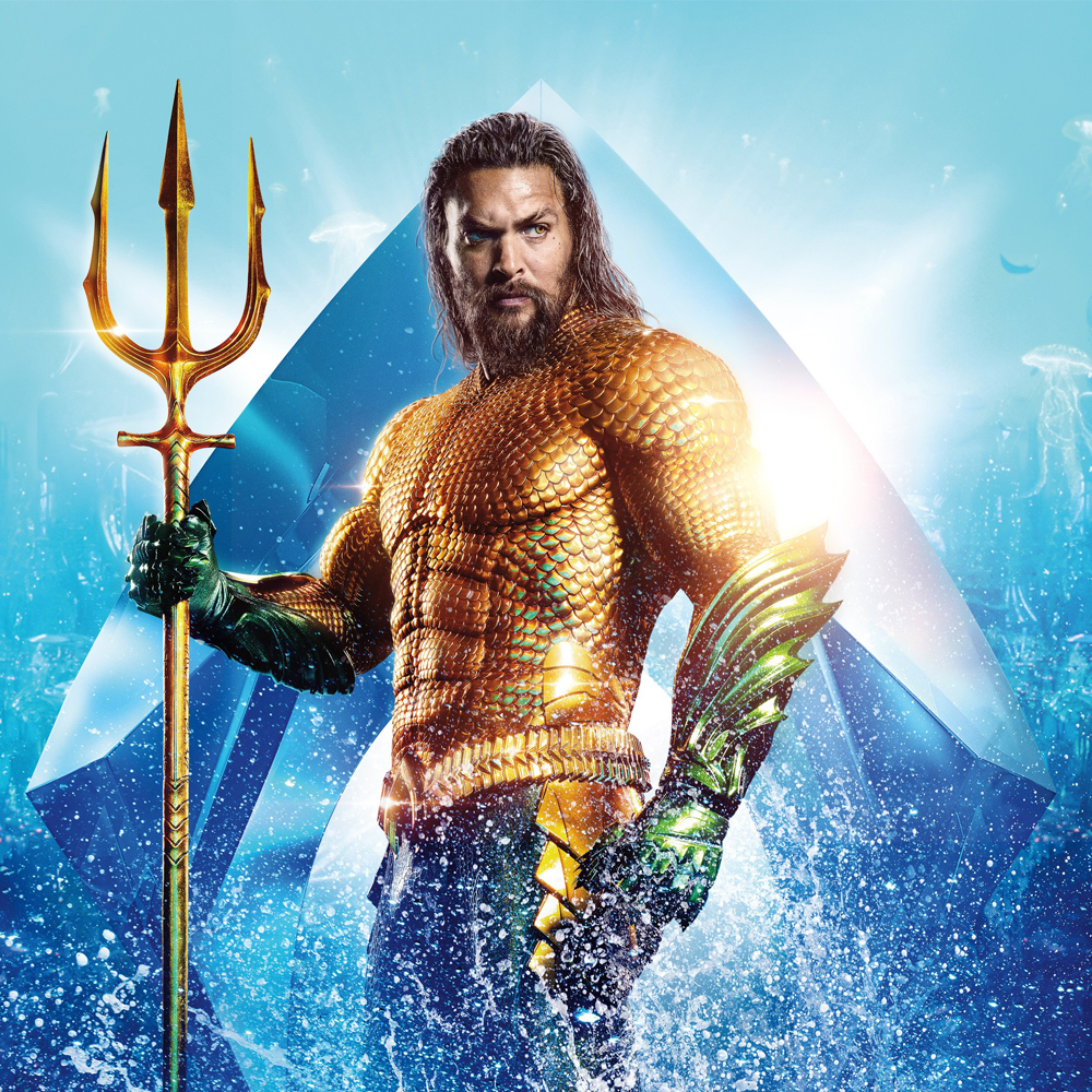
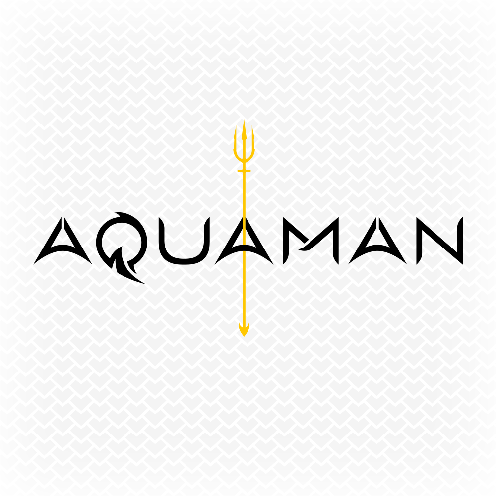
To accompany the typography, I chose to create flat vector versions of the current DCEU Aquaman symbol and the new golden trident that Aquaman acquires in the movie. For presentation purposes, I also created my first ever pattern swatch in Adobe Illustrator of some scales inspired by the tattoos on Jason Momoa’s Aquaman.
Copyright © 2019 Caligature™ • All rights reserved